The document describes the process of designing a magazine cover and contents page. It involves selecting images, adjusting colors, adding text in different layers and fonts, and arranging the elements to create an aesthetically pleasing and organized layout that effectively presents information to readers. Key elements like the masthead, cover lines, and article titles are replicated across pages to establish continuity and brand identity. The process is repeated for a double page spread and additional article pages to develop a cohesive multi-page feature story.
Operation “Blue Star” is the only event in the history of Independent India where the state went into war with its own people. Even after about 40 years it is not clear if it was culmination of states anger over people of the region, a political game of power or start of dictatorial chapter in the democratic setup.
The people of Punjab felt alienated from main stream due to denial of their just demands during a long democratic struggle since independence. As it happen all over the word, it led to militant struggle with great loss of lives of military, police and civilian personnel. Killing of Indira Gandhi and massacre of innocent Sikhs in Delhi and other India cities was also associated with this movement.
2024.06.01 Introducing a competency framework for languag learning materials ...Sandy Millin
http://sandymillin.wordpress.com/iateflwebinar2024
Published classroom materials form the basis of syllabuses, drive teacher professional development, and have a potentially huge influence on learners, teachers and education systems. All teachers also create their own materials, whether a few sentences on a blackboard, a highly-structured fully-realised online course, or anything in between. Despite this, the knowledge and skills needed to create effective language learning materials are rarely part of teacher training, and are mostly learnt by trial and error.
Knowledge and skills frameworks, generally called competency frameworks, for ELT teachers, trainers and managers have existed for a few years now. However, until I created one for my MA dissertation, there wasn’t one drawing together what we need to know and do to be able to effectively produce language learning materials.
This webinar will introduce you to my framework, highlighting the key competencies I identified from my research. It will also show how anybody involved in language teaching (any language, not just English!), teacher training, managing schools or developing language learning materials can benefit from using the framework.
Francesca Gottschalk - How can education support child empowerment.pptxEduSkills OECD
Francesca Gottschalk from the OECD’s Centre for Educational Research and Innovation presents at the Ask an Expert Webinar: How can education support child empowerment?
Biological screening of herbal drugs: Introduction and Need for
Phyto-Pharmacological Screening, New Strategies for evaluating
Natural Products, In vitro evaluation techniques for Antioxidants, Antimicrobial and Anticancer drugs. In vivo evaluation techniques
for Anti-inflammatory, Antiulcer, Anticancer, Wound healing, Antidiabetic, Hepatoprotective, Cardio protective, Diuretics and
Antifertility, Toxicity studies as per OECD guidelines
Embracing GenAI - A Strategic ImperativePeter Windle
Artificial Intelligence (AI) technologies such as Generative AI, Image Generators and Large Language Models have had a dramatic impact on teaching, learning and assessment over the past 18 months. The most immediate threat AI posed was to Academic Integrity with Higher Education Institutes (HEIs) focusing their efforts on combating the use of GenAI in assessment. Guidelines were developed for staff and students, policies put in place too. Innovative educators have forged paths in the use of Generative AI for teaching, learning and assessments leading to pockets of transformation springing up across HEIs, often with little or no top-down guidance, support or direction.
This Gasta posits a strategic approach to integrating AI into HEIs to prepare staff, students and the curriculum for an evolving world and workplace. We will highlight the advantages of working with these technologies beyond the realm of teaching, learning and assessment by considering prompt engineering skills, industry impact, curriculum changes, and the need for staff upskilling. In contrast, not engaging strategically with Generative AI poses risks, including falling behind peers, missed opportunities and failing to ensure our graduates remain employable. The rapid evolution of AI technologies necessitates a proactive and strategic approach if we are to remain relevant.
June 3, 2024 Anti-Semitism Letter Sent to MIT President Kornbluth and MIT Cor...Levi Shapiro
Letter from the Congress of the United States regarding Anti-Semitism sent June 3rd to MIT President Sally Kornbluth, MIT Corp Chair, Mark Gorenberg
Dear Dr. Kornbluth and Mr. Gorenberg,
The US House of Representatives is deeply concerned by ongoing and pervasive acts of antisemitic
harassment and intimidation at the Massachusetts Institute of Technology (MIT). Failing to act decisively to ensure a safe learning environment for all students would be a grave dereliction of your responsibilities as President of MIT and Chair of the MIT Corporation.
This Congress will not stand idly by and allow an environment hostile to Jewish students to persist. The House believes that your institution is in violation of Title VI of the Civil Rights Act, and the inability or
unwillingness to rectify this violation through action requires accountability.
Postsecondary education is a unique opportunity for students to learn and have their ideas and beliefs challenged. However, universities receiving hundreds of millions of federal funds annually have denied
students that opportunity and have been hijacked to become venues for the promotion of terrorism, antisemitic harassment and intimidation, unlawful encampments, and in some cases, assaults and riots.
The House of Representatives will not countenance the use of federal funds to indoctrinate students into hateful, antisemitic, anti-American supporters of terrorism. Investigations into campus antisemitism by the Committee on Education and the Workforce and the Committee on Ways and Means have been expanded into a Congress-wide probe across all relevant jurisdictions to address this national crisis. The undersigned Committees will conduct oversight into the use of federal funds at MIT and its learning environment under authorities granted to each Committee.
• The Committee on Education and the Workforce has been investigating your institution since December 7, 2023. The Committee has broad jurisdiction over postsecondary education, including its compliance with Title VI of the Civil Rights Act, campus safety concerns over disruptions to the learning environment, and the awarding of federal student aid under the Higher Education Act.
• The Committee on Oversight and Accountability is investigating the sources of funding and other support flowing to groups espousing pro-Hamas propaganda and engaged in antisemitic harassment and intimidation of students. The Committee on Oversight and Accountability is the principal oversight committee of the US House of Representatives and has broad authority to investigate “any matter” at “any time” under House Rule X.
• The Committee on Ways and Means has been investigating several universities since November 15, 2023, when the Committee held a hearing entitled From Ivory Towers to Dark Corners: Investigating the Nexus Between Antisemitism, Tax-Exempt Universities, and Terror Financing. The Committee followed the hearing with letters to those institutions on January 10, 202
The French Revolution, which began in 1789, was a period of radical social and political upheaval in France. It marked the decline of absolute monarchies, the rise of secular and democratic republics, and the eventual rise of Napoleon Bonaparte. This revolutionary period is crucial in understanding the transition from feudalism to modernity in Europe.
For more information, visit-www.vavaclasses.com
Acetabularia Information For Class 9 .docxvaibhavrinwa19
Acetabularia acetabulum is a single-celled green alga that in its vegetative state is morphologically differentiated into a basal rhizoid and an axially elongated stalk, which bears whorls of branching hairs. The single diploid nucleus resides in the rhizoid.
Instructions for Submissions thorugh G- Classroom.pptxJheel Barad
This presentation provides a briefing on how to upload submissions and documents in Google Classroom. It was prepared as part of an orientation for new Sainik School in-service teacher trainees. As a training officer, my goal is to ensure that you are comfortable and proficient with this essential tool for managing assignments and fostering student engagement.
Home assignment II on Spectroscopy 2024 Answers.pdf
Dps ps
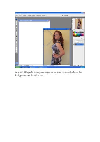
1. I started off by selecting my main image for my front cover and deleting the
background with the select tool.
2. After deleting all the unwanted background I opened up a new page sized A4
and dragged and dropped the image on the new page.
3. After placing the image on the first layer I selected the background and
changed the colour to a slightly lighter grey then the colour of her dress.
4. I then added a sky line on a separate layer. I went on to the dafont website
and tried out a couple of different fonts before copying the font to a new
layer.
5. I then selected the text and using the paint brush coloured in the selected part
of the text in pink.
6. After that I right clicked the layer and outlined the title in black to make it
stand out.
7. I still was not decided on the font so I tried out a few more and also changed
the colour to pink.
8. I decided on this font instead and using the stroke tool added an outline to
this title as well.
9. After deciding on the title I when to the main image layer and flipped the image
so it as facing the other way.
10. I then added on the second part of the title and outline that with white and
placed it below the original title.
11. Next I created the masthead by selecting the old English font and moving the
layer down so the masthead would appear behind the main image.
12. Then using the text tool I added another layer and typed out the sky line
positioning it on top of the black strip I made before.
13. I then started adding in the of cover articles that would feature on the
magazine.
14. For one of the cover articles I had each word on a separate layer and using
free transform moved the text around till I had the best fit.
15. I also changed the colour of the text to make it stand out and create a house
style.
16. I carried on building up the title with individual layers.
23. I typed each new article line an a different layer so if I needed to change
anything I could do without having to redo the whole text.
24. I added in more lines to separate the different articles so readers would not
become confused.
25. After pasting in a barcode I created a new layer and added an issues date and
price.
26. I added in another article to use up the space.
27. And then changed the position of the cover line and adjusted the colour of
the text to tie into the house style.
28. I went back to the main image and using curves enhanced the image to make
the picture stand out more against the grey background.
29. I used free transform to add in the other cover lines reducing the size of the
text and then writing settings so the lines fit more easily in the space.
30. I then added a white box behind the text to make the cover line stand out more
and add dimensions.
43. I also added a page number to the image to correspond to the double page
spread, and then started on the feature articles.
44. I moved the main image to make more room for the text then I created a black
bar and then placed the features title in white on top of it, creating a negative
effect, and then I started creating the articles for my contents.
45. After I had the layout sorted I pasted the image of the front cover on to my
contents page.
46. I then made an issue section and numbered this issue like other magazines do.
47. Underneath the issue shot I created the regulars section in the same format as
the features to create continuity.
48. I then stated adding on the cover articles that would make up the content of
my magazine.
49. I played around with the size of the font to try and fit in the different article
titles and used lines again to separate the different articles.
50. After making the main titles for each story I went back and added quotations
to elaborate on the stories.
51. I created these add-ons individual on different layers, made the font size
smaller and changed the spacing between the letters.
52. I then when to the section I cleared before and added in the additional
information other magazines have on who designed the cover and took the
photos.
53. On the other side I created the page number and added the issue date to
correspond to the front cover.
54. I also added a magazine logo in the same font as the masthead to stand for
maswagger to put on every page.
56. I used free transform the align all the layers so they read one after the other in
a straight line.
57. I also added a second line of text to explain what each section was about.
58. After finishing all of the contents I saved the page and moved on to the
double page spread.
59. I started off but opening an A3 sized page, landscape and adding a heading
box using the rule tool around the edge to divide the page in half.
60. I then selected the same tool again but choosing one with no colour fill.
61. I then selected a black as the colour for the new box on its own layer.
62. And added a stroke to make it stand out more, creating a boxed outline
around the header that matches the contents page.
63. After that I added in the title for the double page spread to match the title on
the front cover and contents page.
64. I then selected one of the original images I wanted to use in my DPS and
opened it, adjusting the size so it would be to the scale of a Polaroid.
65. I then moved the image to a new page as a new layer and using free transform
repositioned the image to look like a Polaroid picture.
66. And the bottom of the picture I wanted to add in a caption, so using the text
tool I selected the space below the picture.
67. I wanted the text to look hand written so I choose a scrip and centred the text.
68. Using the same technique I saved the image and then simply changed the
image so the demotions would be the same.
69. I added in a vertical script in bold caps to make it stand out and increased the
space between each letter.
70. Then using ps brushes I found a hand draw styled heart and added it onto a
separate layer.
71. After seeing the overall finish I switched the image for one that corresponded
to the contents page and saved this as my second Polaroid.
72. I then used this image and my main image, I deleted all the background and
using curves enhanced the image to make it stand out.
73. I gave the picture a slight tint and adjusted the brightness/contrast.
74. I then moved the main image on to the DPS along with one of the Polaroid
pictures to see how much space I had to work with, then started with the title.
75. I created each word on a different layer and staggered them with a slight
overlapping and I also had the colours progress from black to grey.
76. After deciding on the colour of the title I added in my Polaroid pictures on
different layer overlapping them and using free transform angled them.
77. To make the Polaroid pictures more defined I added a dashed outline to the
layer so they could be distinguished but not become over bearing.
78. I then when back to the title and moved the layers around to create a space
for the article and changed “diva” to bold to make it pop.
79. Next I added an introduction on a different layer as the beginning of my
article.
80. I had to go back and readjust the title again to make room for the first part of
my article and changed the colour of “Roxie” to make to stand out as
important to the article.
81. Next I typed up my article in word so I could simply copy and paste it to my
DPS.
82. I copied the article in sections the first two one the DPS and then the rest
onto a third page.
83. I had to create two text boxes of the same size to add the text to and reduce
the font size to fit in the article.
85. Again I created a space at the bottom and added the final touches like the
issue date, page number and logo the all featured on the contents page.
86. Next I opened a final A4 page and pasted the remainder of the article into
three columns.
87. I then added a line to the bottom of the page creating the section for the logo,
page number and issue date along with the magazine website.
88. After adding in the rest of the article and reordering the bottom section I
added a small title heading to correspond to the DPS, I did originally have
another image on this page but I found it looked too cluttered and I already
have enough images on my other pages.
89. Instead of having a picture I took this layer from the DPS and enlarged it as
the background of my third page using free transform.
90. Using the “R” on my third page rather then my DPS creates a common link
between the two pages and shows a consistent theme throughout the article.